I’m a CS student. I’ve taken no classes in graphic design and up until a few weeks ago, I didn’t even know my way around Photoshop. Here I’m going to attempt to offer a few tips to those who are like me. People like developers who need custom icons for their apps, web devs who would like to add some original work, or just anybody who’s interested in how I learned.
First off, as you know, I design for Android. We’re going to have to back up a bit to talk about how I started learning icon design. When we were finishing up the first version of our greenHome app, I was left with the actual visual design left. Since the app has such a simple purpose (merely an organized selection of tips), we wanted to make the interface stand out. Programmatically, we added things like intuitive flick and swipe gestures, rather than just your standard buttons. Visually, we settled on a nice background, and a transparent glass-like theme.
My first attempt at designing the launcher icon was pretty dismal. I took the first few steps correctly, beginning by sketching out some ideas.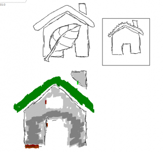
Since greenHome focused on tips for being greener at home, it was natural to try to use some symbolism between the two. Not so bad. Now here’s the first attempt in Photoshop: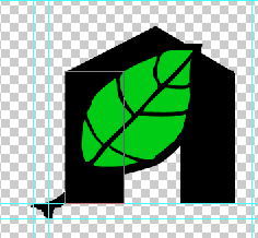 Not exactly pretty. More like terrible. I realized I didn’t know my way around Photoshop in the least. Maybe some tutorials would be a good idea. I headed over to this Illustrator tutorial on how to make leaves. That was helpful, and I was able to make a nice leaf. Unfortunately, when I brought it into Photoshop and scaled it down to the appropriate sizes, it looked like hell. Jaggy lines, anti-aliasing errors left and right, and overall just very ugly. I didn’t know what was going on. Time for more reading. The Android 2.0 Icon Design specs (see the links to the right) helped out a lot with what I was missing. Their main points:
- Design your launcher icon in the mdpi resolution first, then scale up 150% for hdpi and down 75% for ldpi, touching up any issues in each version.
- Conform to the other icon’s design scheme, as far as colors, drop shadow, glow, and variety go. They even provide a very helpful list of colors.
- Keep it simple, but realistic.
The next try was a lot better, and what I ended up going with. Just following their recommendations for color, drop shadow, glow, and bezel helped a ton. The only thing I did a bit differently was not working at the mdpi resolution. I wanted a big version, so I started at 480 x 480 px and scaled down for each resolution. Be sure to mess with the image reduction algorithm in the Image Size dialog box for the best results. The downside to this is that the 36 x 36 icon may not look as crisp without touch-ups.
So onto the Cryclops logo. The name yields itself to an easy symbol, a crying cyclops. I started out Googling what common images of cyclopes looked like and went from there. The first result wasn’t bad at all.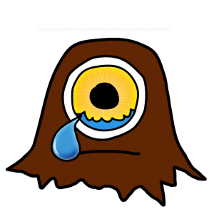 I kept touching it up until I got the above result. I stuck with this logo idea until I actually started thinking about what I wanted my site to look like. I was going for a more professional, crisp vibe. Time for a redesign! This time I didn’t stray too far from the same ideas, just tried to make it less cartoon-y.
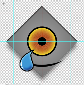 I didn’t take this one too far. For some reason this reminded me of Clippy (oh hell no). A few days went past before I had any other ideas. One day after class, the idea struck me that I should try to make it look old (after all, cyclopes are mythical and stuff). Instead of thinking Greek, I thought Egyptian Hieroglyphics first. Did some more Googling for a Hieroglyphic eye and came upon this Wikipedia page. The idea of a stone eye mixed with realistic water welling up in it struck me as a cool idea, so I started sketching what I saw there and on the image results.
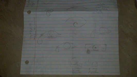 I went with the boxed eye idea, copying this hieroglyph pretty closely. Remembering the Android 2.0 spec’s recommendation that I try to keep things realistic with textures, this design popped out:
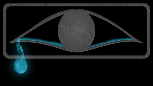 It consists of vector art, a slate texture set to overlay, and a cool Photoshop brush made by this cool dude. I thought it was pretty banging on black, but after letting one of my friends give his opinion, I decided to tweak it a bit. I decided that although the slate texture was cool, it probably would be hard to fit the rest of the site design around that much texture. Next, I decided that without the slate, the realistic water droplet didn’t fit either. I needed a cleaner water design. So I drew in some vector water.
That’s the final result. Four design revisions and around 20 hours of work. Damn this stuff ain’t easy, but I’m happy with the result.
