aVoice is a Google Voice client for Windows 8. It makes use of some neat interaction paradigms:
- Semantic Zoom
- Swipe to Select (a.k.a Cross-Slide)
The video doesn’t show pinch-to-zoom in, but that’s also possible. In the world of touch, these interaction paradigms are pretty new and they aren’t yet mainstream. I’ll tell you how they’re working for aVoice and some pitfalls to avoid.
Semantic Zoom
I’ve seen two uses for it over several platforms:
- A jump list – Windows Phone’s app list is grouped alphabetically. The semantic zoom gets you to apps that start with Z quickly.
- An information filter – Windows 8’s start screen zooms out to let you see a simpler big picture. Note that this is different from Android’s MIUI ROM launcher, which is simply optical zoom.
aVoice uses the information filter semantic zoom.
A heuristic I think applies heavily to the information filter semantic zoom is recognition rather than recall (#6). The Windows 8 start screen does a great job of letting the user recognize what app they’d like in the zoomed out view by creating the illusion that the user is merely optically zooming out, but being a bit smarter. They disable live tiles and replace them with a small version of the app icon:
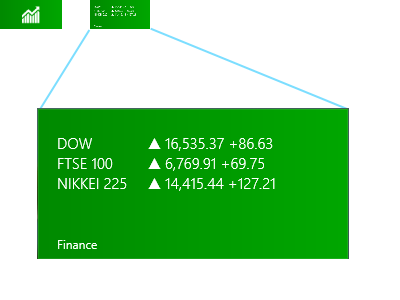
Above, on the upper left is a screenshot of what the Finance app looks like in the zoomed out view (62px x 30px). On the right is what it would look like if the Finance app’s live tile was left on and simply shrunk. Obviously, the left retains meaning while the right does not.
This trick let’s the user recognize where they are spatially and recognize an app by its color and icon.
Unfortunately, aVoice doesn’t work the same way. When zoomed in, messages are in a horizontal stack. When zoomed out, they are in a grid, similar to the start screen. This breaks spatial recognition, and probably explains why I observed friends exclaiming “Wait, where was I?” when using aVoice. In a redesign, I would probably scrap the semantic zoom. It is ill suited for this case. So use caution when considering the information filter style. It could end up being more confusing than helpful.
Swipe to Select
Press-and-hold is the standard selection pattern for iOS (jiggle mode) and Android, but there’s plenty of debate about it.
Swipe to select takes a different approach, allowing users to flick and item down or up to select it. It’s significantly faster than press-and-hold (check out the video here, under Swipe to select, command, and move). However, swipe to select has some issues. Here are a few that I’ve seen with aVoice:
- By virtue of being different, most people attempt to press-and-hold and are confused when it doesn’t work
- Users attempting to quickly pan may accidentally select instead
Press-and-hold results in a hint that you should swipe down, but still doesn’t select the item. This goes against the consistency and standards (#4) of the popular market and ideally aVoice would allow both methods.
Error recovery (#9) is super important to keep a stress-free experience. The accidental selections while panning is worrisome, but fortunately recoverable via the Clear Selection button. If you use swipe to select, be careful about letting it do more than select because the action is frequently unintentional.