Category Archives: Tutorials

Making Blend Designer work with sample data

When you open a *.xaml file, VisualStudio automatically opens a Design view that’s powered by Expression Blend. The idea is to be able to preview/design your UI with XAML without ever having to run the app (or at least not run it as frequently). It’s a huge time saver, but unless your statically assigning values to your XAML components instead of binding to them, it’s not super intuitive to make Blend pull in sample data values at design time. The best documentation I could find for it was for Silverlight.

The Design tab, showing a grouped GridView, filled with data.
The Design tab, showing a grouped GridView, filled with design-time sample data.

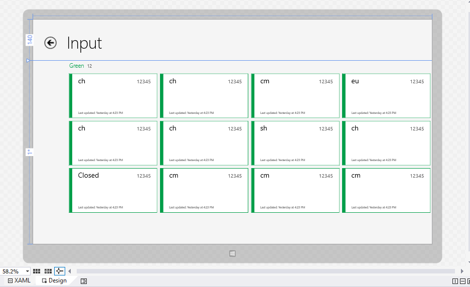
So let’s fill those GridViews with data! There are a few ways to go about it. If you were to create a new Windows Store app based on the Grid App template (Boot VS -> New Project… -> Visual C# -> Windows Store -> Grid App (XAML)), you’d see one way of it working:


<CollectionViewSource
    x:Name="groupedItemsViewSource"
    Source="{Binding Groups}"
    IsSourceGrouped="true"
    ItemsPath="Items"
    d:Source="{Binding Groups, Source={d:DesignData Source=/DataModel/SampleData.json, Type=data:SampleDataSource}}"/>

The d namespace qualifier is at the heart of this — above you’ll see it defined as:

xmlns:d="http://schemas.microsoft.com/expression/blend/2008"

The “blend” in the name tips you off that this is the design namespace. It does not impact running code. So when they said

d:Source="{Binding Groups, Source={d:DesignData Source=/DataModel/SampleData.json, Type=data:SampleDataSource}}"

this is the mechanism for supplying the design data. Go ahead, misspell the path to SampleData.json. The app runs fine, but the Design tab no longer shows data in the GridView.

d:DesignData

DesignData is mode #1. Given:

  • A data file (both XAML and JSON files seem to work)
    • /DataModel/SampleData.json
  • A Type
    • SampleDataSource

Blend is smart enough to populate the GridView with data at this point. XAML data files are strongly typed, but as long as the JSON values have the same name/type as your ViewModel object, it’ll parse in just fine.

This method is OK, but I don’t really fancy it. It requires your sample data file to be directly mapped to Properties on your ViewModel. Unless your service happens to be outputting JSON that’s just perfect for you, your ViewModel will probably differ. Also, if you’re into MVVM, your data is probably coming from a ServiceProvider, and you probably have an interface defining your service calls. This lines itself up perfectly for run-time mocking with sample data, so why not use the same technique for design time?

d:DesignInstance

DesignInstance is mode #2. Essentially, it’s a way of telling Blend, “Hey, I’ve got an object here that you can call the default constructor on when the app’s not running and you can use it to bind”. For the same CollectionViewSource as above:

d:Source="{Binding Groups, Source={d:DesignInstance Type=data:SampleDataDesigner, IsDesignTimeCreatable=True}}"

This corresponds to the following class (a refactored verson of the SampleDataSource class in the Grid app template):

public class SampleDataDesigner
{
    public ObservableCollection<SampleDataGroup> Groups { get; private set; }

    public SampleDataDesigner()
    {
        Groups = new ObservableCollection<SampleDataGroup>();

        Task.Run(async () =>
            {
                await GetGroupsAsync();
            }).Wait();
    }

    private async Task<IEnumerable<SampleDataGroup>> GetGroupsAsync()
    {
        await GetSampleDataAsync();

        return Groups;
    }

    private async Task GetSampleDataAsync()
    {
        if (Groups.Count != 0)
            return;

        Uri dataUri = new Uri("ms-appx:///DataModel/SampleData.json");

        StorageFile file = await StorageFile.GetFileFromApplicationUriAsync(dataUri);
        string jsonText = await FileIO.ReadTextAsync(file);
        JsonObject jsonObject = JsonObject.Parse(jsonText);
        JsonArray jsonArray = jsonObject["Groups"].GetArray();

        foreach (JsonValue groupValue in jsonArray)
        {
            JsonObject groupObject = groupValue.GetObject();
            SampleDataGroup group = new SampleDataGroup(groupObject["UniqueId"].GetString(),
                                                        groupObject["Title"].GetString(),
                                                        groupObject["Subtitle"].GetString(),
                                                        groupObject["ImagePath"].GetString(),
                                                        groupObject["Description"].GetString());

            foreach (JsonValue itemValue in groupObject["Items"].GetArray())
            {
                JsonObject itemObject = itemValue.GetObject();
                group.Items.Add(new SampleDataItem(itemObject["UniqueId"].GetString(),
                                                   itemObject["Title"].GetString(),
                                                   itemObject["Subtitle"].GetString(),
                                                   itemObject["ImagePath"].GetString(),
                                                   itemObject["Description"].GetString(),
                                                   itemObject["Content"].GetString()));
            }
            this.Groups.Add(group);
        }
    }
}

At first, this doesn’t seem like a very large improvement, but remember, you should be using a ServiceProvider:

public class SampleDataDesigner
{
    public ObservableCollection<SampleDataGroup> Groups { get; private set; }

    public SampleDataDesigner()
    {
        Task.Run(async () =>
            {
                IDataService service = ServiceProvider.Current.GetService(typeof(IDataService)) as IDataService;
                Groups = await service.GetGroupsAsync();
            }).Wait();
    }
}

Much, much simpler. You get to share code that populates your Design view, populates your app in a sample-data mode, and probably populates your unit tests.

Oh, and one more thing. If you need to tell (in code) whether the instance has been started by the Blend Designer or not, use DesignModeEnabled.

Stupid Simple Azure Logging for Cloud Services

So, you’re making an Azure Cloud Service. A Cloud Service consists of either a Web Role, a Worker Role, or a combination of the two, working together to provide users with a solution that’s always on and highly scale-able. Good call!

The thing with a service is that it’s expected to be reliable. It’s also in the cloud, and there are often multiple instances of your code running at any one time, so it’s hard to attach a debugger to. Essentially, this leaves us with printf littering as our debugging mechanism for production code. Best practice is to log a ton of data, such as:

  • Tracing the follow of execution
  • Logging error conditions, such as exceptions, null values
  • Logging variable values that will actually help you figure out what’s wrong

How do I log?

Trace.WriteLine() will work — and if you’re OK with that, then stop reading here. The Azure Cloud Services VS template hooks this up out of the box (note that Debug.WriteLine() writes to VS’s Output window by default, but won’t end up in Azure’s log tables without some configuration). But you’re likely going to want more control than just WriteLine(). Why? If you follow best practices, you’ll end up with a lot of log statements. You’ll need some control over granularity — do you just want to see errors and warnings? Just the flow of execution? Seeing everything at once will overwhelm you.

Fear not, the Trace class with help you with SourceLevels, which divides up log statements into well defined categories.

OK, that’s great, but I don’t see Trace.Write(SourceLevel, string) methods

Well, there is Trace.TraceError(), Trace.TraceWarning(), and Trace.TraceInformation(), but that’s only 3 of the 6 possible SourceLevels. And what if you want the goodness in Trace.WriteIf() in these?

Of course, .NET provides an answer in the form of TraceSource and TraceListener. You’ll need to create your own TraceSource object, passing it around and calling myTraceSource.TraceEvent(). Damn, this is getting complicated. You came here for printf littering, not passing around logging objects.

Have a (static) class


/// <summary>
/// Wapper class for writing output.
/// </summary>
public static class Trc
{
    #region Private fields

    private static TraceSource traceSource = new TraceSource("CustomTrace", SourceLevels.All);

    #endregion

    #region Public methods

    public static void Error(string message)
    {
        HelperTrace(TraceEventType.Error, message);
    }

    public static void Error(string format, params string[] values)
    {
        HelperTrace(TraceEventType.Error, format, values);
    }

    public static void ErrorIf(bool condition, string message)
    {
        HelperTraceIf(TraceEventType.Error, condition, message);
    }

    public static void ErrorIf(bool condition, string format, params string[] values)
    {
        HelperTraceIf(TraceEventType.Error, condition, format, values);
    }

    public static void Information(string message)
    {
        HelperTrace(TraceEventType.Information, message);
    }

    public static void Information(string format, params string[] values)
    {
        HelperTrace(TraceEventType.Information, format, values);
    }

    public static void InformationIf(bool condition, string message)
    {
        HelperTraceIf(TraceEventType.Information, condition, message);
    }

    public static void InformationIf(bool condition, string format, params string[] values)
    {
        HelperTraceIf(TraceEventType.Information, condition, format, values);
    }

    public static void Warning(string message)
    {
        HelperTrace(TraceEventType.Warning, message);
    }

    public static void Warning(string format, params string[] values)
    {
        HelperTrace(TraceEventType.Warning, format, values);
    }

    public static void WarningIf(bool condition, string message)
    {
        HelperTraceIf(TraceEventType.Warning, condition, message);
    }

    public static void WarningIf(bool condition, string format, params string[] values)
    {
        HelperTraceIf(TraceEventType.Warning, condition, format, values);
    }

    #endregion

    #region Private methods

    private static void HelperTrace(TraceEventType category, string format, params string[] values)
    {
        HelperTrace(category, string.Format(format, values));
    }

    private static void HelperTraceIf(TraceEventType category, bool condition, string format, params string[] values)
    {
        HelperTraceIf(category, condition, string.Format(format, values));
    }

    private static void HelperTraceIf(TraceEventType category, bool condition, string message)
    {
        if (condition)
            traceSource.TraceEvent(category, 0, message);
    }

    private static void HelperTrace(TraceEventType category, string message)
    {
        HelperTraceIf(category, true, message);
    }

    #endregion
}

Just use Trc.Error(), or a sister function throughout your code. Yes, this only has 3 of the 6 as well, but you’re free to add your own — it’s easy to extend. Why couldn’t this be a set of extension methods for Trace? Unfortunately, C# doesn’t allow for static extension methods, you can only use them on an instance of an object, which would put us right back to square one.

That’s not all though you’ve gotta do though. I wish it was, but the next bit seems unavoidable. You’ll notice that the Trc class writes to a TraceSource, given the name “CustomTrace”. If you stop here, nobody will be listening to the “CustomTrace” source, and you’ll see no output. To setup listeners, you’ll need to head to your config file. In a Worker Role, this is your app.config file:

<?xml version="1.0" encoding="utf-8"?>
<configuration>
  <system.diagnostics>
    <sharedListeners>
      <add
        type="Microsoft.WindowsAzure.Diagnostics.DiagnosticMonitorTraceListener, Microsoft.WindowsAzure.Diagnostics, Version=2.1.0.0, Culture=neutral, PublicKeyToken=31bf3856ad364e35"
        name="AzureDiagnostics">
        <filter type="" />
      </add>
    </sharedListeners>
    <sources>
      <source name="CustomTrace">
        <listeners>
          <add name="AzureDiagnostics"/>
        </listeners>
      </source>
    </sources>
    <trace>
      <listeners>
        <add name="AzureDiagnostics"/>
      </listeners>
    </trace>
  </system.diagnostics>
</configuration>

The drain you want to pour all messages down is the sharedListener named AzureDiagnostics. You can see that “CustomTrace” and <trace> (meaning the default Trace.WriteLine(), Trace.TraceError(), etc calls) both have the AzureDiagnostics listener. This will ensure that all of your logs end up in all the right places.

Where do my logs go?

Well, when you’re debugging locally using the Azure emulator, they show up in Visual Studio’s Output window. That’s great for local debugging, but when your service is live you’ll need a more permanent storage solution. You might not find out about an issue until days after it occurred, so you need the logs stored for you.

Azure does this for you automatically in the form of the WADLogsTable (WindowsAzureDiagnosticsLogsTable). The AzureDiagnostics TraceListener conveniently writes both to the Output window and to the WADLogsTable. There are a number of ways to view the table, but the easiest is using the Server Explorer in Visual Studio:

Server Explorer is under the View menu.
Server Explorer pane is under the View menu.

View Diagnostics Data takes you to a summary page.

A nice summary of your Service.

Windows Azure application logs is where your Web or Worker role logs to. Click the drop-down arrow next to it to see details, and hit the View all data link to get to the actual WADLogsTable, which will show all the logs. You can delete stale logs here if needed.

Restricting the flow of information

You went through the trouble of deciding whether to log an error, warning, or informational message, so you’d probably like to be able to filter on those levels. You could log all messages and then filter the WADLogsTable based on your desired level, but you might run out of space rather quickly.

One solution is described by Mike Kelly in Take Control of Logging and Tracing in Windows Azure. I started with that solution, but it was too complex for what I was creating and it actually duplicates some functionality built-in to Azure. However, if you wanted multiple TraceSources (say one for logging setup task information, another for core logic) and wanted to regulate the log level of each independently, Mike’s solution is the way to go.

That said, here’s how I switch log levels on the fly, without having to bring my service down to do it. Look at the Update Diagnostics Settings… option in the same dialog as before:

Server Explorer is under the View menu.
Anything you update here updates directly in the cloud service, on the fly.

Under the “Application logs” tab, you can easily change your log level. In this case “Warning” means log Warning, Error, and Critical to the WADLogsTable.

What this does behind the scenes is updates your diagnostics.wadcfg file. The other tabs do lots of other great things, but that’s beyond the scope of printf littering.

MIUI Theming Mania!

I made the mistake of having some free time on Sunday, so I got sidetracked putting the latest version of MIUI on my Droid X. I’ll do a quick side note for anybody who wants it on there too:

  • You’ll need some files, so start downloading:
    • The latest version of MIUI (1.9.23) or direct link
    • Your Droid X should be on Gingerbread (preferably 4.5.602). If you need to SBF, look here
  1. Make sure the DX has Gingerbread (they said any version will work, but I’m on 4.5.602)
  2. Root it (Pete’s tools work really well)
  3. Install ROM Manager. I’m reasonably sure that installing Clockwork from there and rebooting should do it
    1. NOTE: I had to turn off USB Debugging in order to be able to boot into Clockwork. Don’t know why
  4. Put the MIUI zip on your SD
  5. Reboot into recovery
  6. Clear data/cache, etc
  7. Install the MIUI zip
    1. NOTE: I’m assuming you’re already comfortable with this stuff. If you’re not, Google around for some better tutorials
    2. NOTE: This is all possible through the magic of 2nd init. If you’d like to read about that, check it out
Anyway, I got carried away with theming.
I wrote a custom mClock for the top. Just download this and unzip it on your SD card. It’s made to be a 4×2 widget. The XML wasn’t hard to learn, but it’s pretty cool that the creator of mClock allows you to quickly work like this. His documentation isn’t good at all, and the API doesn’t quite make sense, but look at some examples and you’ll get it.
You can find the wallpaper here. The launcher is Go Launcher EX with the grid set to 5×5. The little page opens the app drawer, which is currently just a SIMI Folder. There’s only 1 homescreen, but I could add more to the right (icons stay on land). The only thing that bums me out is that the bottom dock won’t stay static. I wish I could just restrict the dock to the app drawer on the far right. Might mess around with SweeterHome, which looks like it can do that. The icons are Fluxed by Vazguard.
There’s a custom lockscreen going on now too. I based it off of a theme called examinationEX (I couldn’t find a link to the creator). Luckily, it’s pretty easy to make your own lock screens in MIUI. Again, not a well documented method for the XML, but I figured it out. Basically, I just repositioned some things and swapped out images. Also, it’s one of the few MIUI lock screens that has music controls too. No biggy, but the result looks great!

Simple Glass Buttons in Photoshop

click to enlarge

For my group’s greenHome application, we designed a main screen that takes the user to one of 6 rooms in the house. The app features a very clean interface that separates it from the majority of Android apps, and we wanted to keep it that way. I was tasked with designing an icon for each of the rooms to put into a GridView. Some of the choices I had to face were:

  • How detailed should the icon be to be effective on all screen densities (hdpi, mdpi being the target audience)?
    • For example, an icon that has high detail at 150 x 150, will look absolutely terrible at 48 x 48, since there is no way for the details to be “crunched” into less pixels and look good.
  • On that note, should I create multiple versions of the icon with different detail levels?
  • How should the design distinguish itself from Android in general, yet fit with the app’s UI?
  • Transparent or opaque?
  • Colors.

The first thing I went about doing was deciding that it would be nice to offer semi-transparency, since we had a nice background, and I was planning on transparencies being common throughout the app. I searched Google for “android glass icon” and got this, which shows a Vista/Aero-ish effect. To get that top shine effect, I remembered a cool tutorial I’d seen called Design The iTunes Icon For The iPhone And iPod Touch.

For colors, I went with the Android color recommendations in the Icon Design Guidelines, Android 2.0 spec, selecting their grey tones.

Here’s how you can make a bedroom icon that looks like this:

1. Open Photoshop, go to File -> New… and create a new image with your preferred dimensions (150 x 150). Select RGB color, 72 pixels/inch, and a transparent background. Click OK.

2. Next, go about setting your guides, to ensure that you have a symmetrical icon. Give yourself 5px of padding on all sides. This will allow glow/drop-shadow effects to not be cut off. Go to View -> New Guide… -> [vertical, 5 px] OK. Then put another vertical on at 145 px (150 – 5). Do the same, only with the horizontal option selected. Turn on Snap by View -> Snap To -> Guides. It should now look something like this.

3. Now it’s time to draw the background. Name the base layer Photoshop created “background”. Choose the Rounded Rectangle Tool (U). Set the radius to 8 px. Choose black for the color. Start at the where the guides intersect at the top left corner and drag to the bottom right. Let the shape snap to the guides and release.

4. Now right click “background” in the layers pane and select Rasterize Layer. This will convert the vector shape to bitmap. Duplicate “background” by selecting Layer -> Duplicate Layer. Name the duplicate “accent” and put it above “background”. Turn off its visibility and reselect “background”, we’ll come back to the “accent” later. Now, hold down Ctrl or Cmd and click the layer thumbnail for “background” to select it. You should now see a dotted line around the border of your shape. Select the Gradient Tool (G). Set its options to Linear Gradient, then click to edit the gradient. Select the first preset, Foreground to Background, and set the first color to black and the second to white. Click OK. Now draw the gradient over your shape vertically (make sure the shape is still selected) by holding down Shift to keep it at 90 degrees. Drag from the bottom to the top. Now turn the layer transparency down to 55%. Try to get it to look like this:

5. Remember that layer we named “accent”? Select it and make it visible again. It should now obscure the semi-transparent layer completely. The idea now is to create the curve that will make this button appear 3D, or make it “pop”. Select the Elliptical Marquee Tool (M). Click and drag it so that there is a light arch cutting the square in half horizontally. When you like the shape that you see, invert your selection by Select -> Inverse (Ctrl + Shift + I). Make sure the “accent” layer is selected and press Delete. Then de-select by hitting (Ctrl/Cmd + D). It should now look like this:6. Drop the opacity on the “accent” layer a great deal. I dropped it all the way to 9%. Your basic button is now done. However, it would be nice to add a 1 px opaque border to the icon to distinguish its edges (since it is semi-transparent). To do this, create a new layer above everything. Name it “edge”. Select the Rounded Rectangle Tool (U) again with the same settings (8 px radius), only this time make it white. Drag it out again, from the top left corner to the bottom right and let it snap to the guides. It should now cover everything perfectly.

7. Once again, rasterize the “edge” layer and select it by holding down Ctrl or Cmd like in step 4. Now go to Select -> Modify -> Contract. Contract by 1 px and press Delete. You should now be left with a white, 1 px wide border around your button. Your layer layup should be “edge” at the top, followed by “accent”, with “background” at the very bottom. Turn off the guides by View -> Show -> Guides (Ctrl/Cmd + ; ). Zoom in and in inspect your work. The border should look like this now:

8. Our basic button is done now. A wise idea would be to save this file as a template for future buttons. File -> Save (Ctrl/Cmd + S) and name it “glassButtonTemplate.psd” or something. Then we’ll start our bedroom icon by File -> Save As (Ctrl/Cmd + Shift + S) and name it “bedroomGlassIcon.psd”.

9. Highlight the “background layer by clicking on it, then hold down Shift and click the “edge” layer. All 3 layers should now be selected. Right-click on any one of them and select Convert to Smart Object. Name the new layer “buttonBackground”.

10. It’s time to go about creating our actual bed icon design. There are several factors to consider when designing a symbolic representation of something. Consider reading 10 Mistakes in Icon Design. One example I like is Apple’s mailbox example. Although in the US, we’re used to mailboxes looking like this, around the world, they can actually look quite different around the world, so it is important to consider your potential audience. I started on the bed icon thinking of the lodging signs I see all over the highway. Googling “bed icon” usually gives a pretty good representation of what your bed should look like.

11. Now on to the actual drawing. Select the Rectangle Tool (U). Set the color to white. Start with your basic shapes, and work detail out from there. I started with the mattress. Keep working, switching between the Rectangle Tool, Rounded Rectangle Tool (be sure to keep your radii constant), and the Ellipse Tool. Some helpful keyboard modifiers/tips are:

  • Holding down Shift while drawing will lock your aspect ratio. If your drawing a rectangle, it will force a square. If your drawing an ellipse, it will force a circle.
  • Holding down Alt/Option while drawing will let you draw from the center, rather than a corner.
  • Holding down both Shift + Alt/Option of course does both functionalities at the same time.
  • In the toolbar for these tools, there are a set of 5 icons to the right of the Radius field. If you select the third one, Subtract from shape area, you can draw new shapes over existing ones that delete the base shape wherever they overlap. This is nice for keeping your shape as a vector, yet being able to access more shapes than just rectangles and ellipses.

12. You should now have your icon looking good. Select all of your new shape layers in the same manner as before and convert them to a smart object. Name this one “bed”.13. It is now time to add the title of the icon, if you wish. You should add a guide to snap to so that all of your icons have their title in identical spots. I set mine horizontally at 125 px.

14. Select the Horizontal Type Tool (T). Pick a readable font, size, white as your color, and type “bedroom”. Click the check box in the toolbar when your finished.

15. Select the Move Tool (V) and make sure guide snapping is on. Drag your text so that it snaps to the guide. Center it up as best you can, and then select the “bed” layer and center this one up as well. If you need to resize anything, worry not. Because we’ve created smart objects, instead of simply merging layers, our vector shapes are preserved, and may be resized indefinitely. To resize a layer, enter Free Transform mode (Ctrl/Cmd + T). Once everything is to your liking, it should look like this:16. You’re done! File -> Save As to save it as a PNG (always use PNG for icons. Use JPG for pictures that don’t have many straight lines).

Here’s how mine look in the app:

click to enlarge