Category Archives: Design of Information

Soliloquy

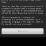
Design of Information just get’s more interesting! For our 3rd homework, we had to take Shakespeare’s plays (XML-d by Jon Bosak) and display their data in some interesting way. I went with Android as it’s the medium I’m most comfortable with. Soliloquy is the app’s name and it was churned out in about 6 hours (I’m amazed it went that fast).

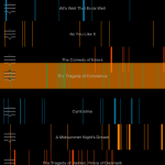
Soliloquy is an Android application that tries to analyze each one of Shakespeare’s plays for soliloquies. It displays what it finds in a “time line”. The x-axis spans from the first to the last line of the play. The x-axis is colored whenever a soliloquy is detected. This leads to a spatial sense of Shakespeare’s method. The user can observe patterns in soliloquy occurrence and length.

The user may interact with Soliloquy by touching and dragging the handle on the left side of a list element. This will free the element from its position in the list and allow the user to move the element to a new location. This allows the user to group plays by pattern. Shakespeare follows a methodical approach to writing tragedies and comedies. Soliloquy allows the user to detect these and organize them. After organization, a pattern should be visible by comparing the two plays side-by-side.

Clicking on a play will bring up all of the soliloquies for that play, where they may navigate through them by scrolling.

Implementation

The application first performs a setup where it parses each play. This is broken up into multiple threads to allow the user to read the instructions while waiting using Android’s AsycTask. I highly recommend it over normal Java threading.

The parsing is done using Java’s SAX Parser. The title and number of lines are recorded for each play. Soliloquies are detected by watching for <STAGEDIR> elements containing “Exeunt”. I noticed that if a <SPEECH> element appears directly after a <STAGEDIR> containing “Exeunt”, a soliloquy usually follows. Obviously this process is not perfect, but it seems to grab most of the big ones. For example: all of Puck’s soliloquies are detected in A Midsummer Night’s Dream. Each soliloquy goes into a Block data structure. A Play structure holds a list of Blocks.

The resulting plays are then displayed using a custom View that draws rectangles with the same width and spacing as the soliloquies occur in the poem. This TimelineView is part of a custom TouchListView’s items. TouchListView allows the elements to be reordered is courtesy of commonsguy on GitHub.

The code is very simple, with an MVC architecture similar to most other Android applications. SoliloquyActivity.java is the entry point, and ParserHandler.java contains most of the XML parsing code. PlayAdapter.java is the model that the list adheres to.

Overall I think the code is clean. I’ve got it under git and might improve it for fun later :D.

Journal #1: HW1

This is the first post in my blog-based journal for my CS 4364 capstone class at Virginia Tech. It is Design of Information, and we are being asked to write journal entries throughout the class relating to homeworks, projects, and just about anything else worth writing about. I may move it somewhere else later, but this was an easy seat for now.

For our first homework, we were asked to look around us at signs. Prof. Harrison defines signs as intentionally placed pieces of information. Obviously, this is a pretty broad definition that allows for non-traditional sign selections. In this entry, I’m just going to pick a few signs and talk about why I picked them.

One of the signs we were asked to find was a dynamic display — one that changes what information is displayed as part of its purpose. After thinking of the obvious (plasma TV’s, electronic highway safety signs), I was looking at my shadow as the sun was setting, wondering at how long it was. I’m not sure if it completely qualifies as intentionally placed, but I would suggest that a shadow is a dynamic display. It’s appearance is a constant indicator of the time of day, weather conditions, object shape, and I”m sure many more.

I’ll share some of the other non-dynamic signs I found while riding my bike around DT Blacksburg. We were told that a piece of trash blowing down the street did not count. Again, I’m not sure how much this next example intrudes on that, but I thought it was a very interesting sign.

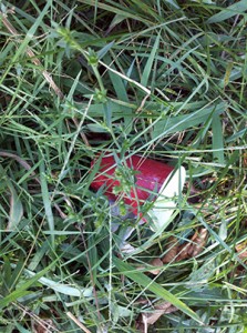
A red solo cup rudely thrown in the grass on the side of the road. I’m assuming that it still rests where it was thrown, which is why I consider this information useful. I took several other pictures of Coors, Red Bull, Natty, and Yuengling (classy) cans along the same stretch. The point: I think this cup, along with the other trash, is a solid sign that drunk kids walk the stretch of road in front of the Sig-Ep house on Clay St. frequently. Intentional? Ehhh — maybe. We’ll see what Harrison thinks.

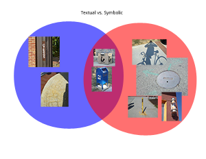
Anyway, I ended up with 16 photos from places around downtown and called it a day. The next step was to organize this information in 3 creative ways (Design of Information is big on information organization). My first thought was to break the signs into two categories: text-based and sign-based. Then I realized that some signs (such as a post box) had both. What do you do when you have 2 distinct categories with some that overlap? Venn diagram!

Simple. OK, what’s next? I was stumped for any creative ideas for a little while, focusing too much on the content of the pictures. The last 2 ideas came at once.

  1. Somebody might care where these photos are. I remember where I took each one as I biked. Why not map them by location so that somebody could retrace my steps and guess at my path?
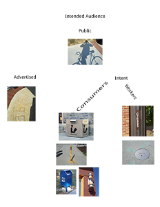
  2. How about who each sign targets as its audience? Certain signs are meant for a very specific audience.
I realized that the 2nd option actually left a lot of room to include a small hierarchical organization, so I decided to give it a shot.
Totally unsure how how useful this one is, and it’s the organization I’m least proud of. But oh well, that’s all for now. I’ll include some thoughts on Design Observer in the next post.