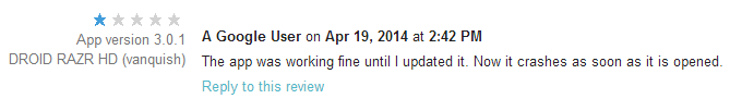
RingPack just underwent a major overhaul. With large amounts of code churn, it starts to become likely that new bugs will be introduced (especially Android’s fragmentation problem). This update was no exception — within 3 hours of pushing a live update, I saw a new crash, a few angry reviews, and one very upset email. Yikes!
There’s a powerful lesson here. Budget time to rapidly respond to user issues on a new release. Luckily, I did. The telemetry data from the Android Developer Dashboard and Google Analytics let me respond within hours.
The surprising thing is how quick users are to forgive once they realize you’re willing to work with them. Even something so impersonal as replying to their review does a lot to diffuse the situation. Of course, your mileage may vary depending on how critical your app is to the user’s life.
Adoption
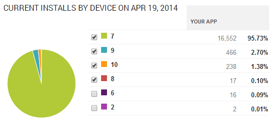
I was curious how quickly people would upgrade. The answer is — not very quickly.
This is 48 hours from the launch of version 8. The subsequent versions are minor bug fixes.
Roughly 700 users saw the update and gave it a try. Amazingly that’s only about 5% of the user base. I see that as both good and bad. On one hand, lazy updating means more users with a sub-par experience. On the other, it’s nice that only 5% hit the nasty crash in version 8.
In conclusion,
Budget time to rapidly iterate
Be responsive and respectful to all users (even the angry ones)
Love your telemetry
Following these rules can quickly reverse the damage done by a rocky launch.
Over the weekend I got bored with my homescreen. I tried several widgets like BattStatt, Tajm, dClock, and TypoClock, but they all took up at least 2 rows of my homescreen, or I didn’t need the information. I loved dClock’s week display since the actual day isn’t obviously visible on Android anywhere but the lock screen. So I went ahead and made my own simple week widget over the weekend.
Obviously, the week widget needs to display the correct day to the user, which can vary depending on time zone. It should also know when midnight/the start of the new day is, so that it may change. I’ll share with you how to get the current time relevant to the user.
/**
* The private getDay method gets the current time zone and then returns
* the integer day of the week for this time zone.
*
* @return The day of the week (see Calendar.SUNDAY)
*/privateint getDay(){TimeZone t =TimeZone.getDefault();//gets the phone's curr timezone// create a our current time zoneSimpleTimeZone pdt =newSimpleTimeZone(t.getRawOffset(), t.getID());// set up rules for daylight savings time for 2010, US
pdt.setStartRule(Calendar.MARCH, 14, 2*60*60*1000);
pdt.setEndRule(Calendar.NOVEMBER, 7, 2*60*60*1000);// create a GregorianCalendar with the Pacific Daylight time zone// and the current date and time
calendar =newGregorianCalendar(pdt);Date trialTime =newDate();
calendar.setTime(trialTime);return calendar.get(Calendar.DAY_OF_WEEK);}
This method returns the current day of the week depending on the user’s timezone. The Daylight Savings is adjusted to this year’s US date’s, but you could easily add clauses to change it for other countries.
Now that you have the day, you can easily calculate where midnight will be (either by raw calculation or just create a new calendar and bump it forward to the desired date/time). I used AlarmManager to set a repeating alarm every day.
OneSeven is available in free and pro versions. Please click here to view the features of each.
Today, I’m launching my very first app under the Cryclops name. It’s called RingPack, and is currently available on the Android market in beta testing.
The idea started with a very simple desire. I get a lot of texts/notifications, and usually whatever ringtone I choose for my text ringtone (the Default Notification Ringtone in Android), I grow to hate after a while. It starts with loving the new tone, and being impressed with it for a few weeks, but then — just like a hit song on the radio — the repetition finally gets to me and I can’t stand it anymore.
RingPack started as a solution to this annoyance. I thought it would be kind of fun to not know what sound your phone was going to make next. Obviously, I want my actual ringtone (the one people get when they call me), to remain the same, otherwise I wouldn’t know what was ringing. But the text notification had some room to wiggle. So I came up with 3 main ideas I wanted to accomplish:
The first idea was to have the app shuffle around different, yet similar sounds. For instance, it would shuffle your tone between all known guitar chords in the key G. This way, you’d still be expecting the correct pitch, but you wouldn’t know the exact mood of whatever chord was coming.
Then I thought about theming. I loved Ocarina of Time as a kid, and wouldn’t it be cool to have a themed set of notification tones, all from the same game. That way, instead of just recognizing it by key, I would recognize it by association.
Lastly, I remembered my girlfriend, who always has the same exact song snippet as her text tone. “Still D.R.E.” That gets stuck in your head all day. Wouldn’t it be cool if your phone could progress through the song as you get texts?
So I thought I’d pack together ringtones in “packs” and make an app to manage them.
Long story short, after a month of development I’m proud to release the beta version of RingPack. I think you’ll like the UI, especially the implementation of custom QuickActions based on this tutorial. The app is based around a Service, to swap out tones in the background, and BroadcastReceivers, to tell the Service when it needs to make a change.
I ran into some limitations on my “perfect” idea of an implementation simply due to constraints in the Android framework. For instance, the only notification I can listen for is incoming SMS’s. Things like incoming Google Talk and Voice messages simply don’t seem to be a thing that I can detect. To compensate for this, I’ve given the user the option of listening for time ticks instead. You can have your tone rotate on either 1 minute or 5 minute intervals. In the future, I’ll probably give the user more options (perhaps once daily, weekly, after every phone call).
Features include:
Intuitive UI
(2×1) Widget
Shuffle, Lock, and Rotation preferences
Easy on the battery background service
Extend-able packs! (I’ll post more on how you can make your own packs soon)
I’m allowing Android 1.6 and up to install it, although users who are below Android 2.0 might experience some issues with the background service. Android 1.6 has some issues with restarting the service. I’ve done my best to try to fix those issues for now, but as I’m testing on 2.2, I can’t confirm for sure.
Known bugs:
The 1.6 thing
Playing mp3 ringtones very quickly (using the widget) will result in the mp3 decoder becoming overloaded and Android will panic and reset the Default Notification Ringtone to it’s most basic one. If this happens to you, simply open RingPack, select the “None” pack, then your desired pack and it will return to normal. I’m working on this. It seems ogg files may be a better choice.
After a restart, RingPack can take up to 1 minute to restate itself.
Sometime the interface is slow to respond. I’ve not been so good about breaking into Threads. This is my first priority to fix.
If the app Force Closes on you (which I’ve done my best to stop. In fact in the last week of testing, I haven’t hit any), it has the potential to leave a orphan entry in your MediaStore library. It’s not harmful, but if you’d like to clean it up, I recommended using the ever popular ringdroid. Just open it, click Menu>Show All Audio>Search for “ringpack”. If there’s an entry there, longpress it to delete it and you’re all cleaned up. There is a special case where the Service manages to delete the file, but misses the MediaStore library entry. Ringdroid will tell you that it couldn’t delete the file in this case, but it lies. The entry will have been removed from your library. I’ll definitely be implementing my own fix for this type of thing soon, but for now this works.
Lastly, screenshots can be found on the official RingPack page. Look there in the future for more goodies.
This semester at Virginia Tech, a friend and I lucked out with the opportunity to join up with a professor doing research in how to use smartphone features to save energy. We’re using things like the light sensor, the accelerometer, and the GPS to save energy in neat ways. However, the first app to come out uses none of these. Think of it as an advanced Hello World.
The idea behind greenHome is to give the user energy saving tips depending on their location in the house. It starts with a homescreen that lets the user pick what room they’d like tips about, then brings up a list of tips. We let the user navigate through these in some cool ways.
click to enlarge
The user can navigate through tips in this activity by either touching the left and right arrows at the top, or flicking left or right, as long as the flick is in the content. We used a custom ScrollView nested inside of a custom ViewFlipper to accomplish this with nice animations. I’ll post a tutorial on how to use a ViewFlipper soon.
What’s cool is that we share touch events between the ViewFlipper and the Scrollview, which is a bit tricker than you’d think.
//flipper is my custom ViewFlipper
flipper.setOnTouchListener(new MyOnTouchListener());publicclass MyOnTouchListener implements OnTouchListener {
@Override
publicboolean onTouch(View view, MotionEvent e){//give the scroller it's data//sc1 is the first child view of flipperif(flipper.getCurrentView().getId()== R.id.sc1)
scr1.onTouchEvent(e);//sc2 is the second child viewelseif(flipper.getCurrentView().getId()== R.id.sc2)
scr2.onTouchEvent(e);//reset on releaseif(e.getAction()== MotionEvent.ACTION_UP)
firstTouch =true;//check for a flick...returntrue;}}
The above code has some weird aspects. Stepping through it, we
Set the ViewFlipper’s OnTouchListener to MyOnTouchListener.
In the onTouch() method, we begin by handing down the touch data given to us (since we’re the parent in the layout) to one of our visible children (sc1 or sc2) by calling the child’s onTouchEvent.
Take care of flipping (I’ve taken that specific code out for simplicity).
Return true.
The un-important looking return true is actually very important. It turns out that if a view’s onTouch() method returns true, that means that this event has found it’s home, and it does not need to continue to other view’s. Logically, I would think that I’d want to return false here, since I’d love not to have to give out the event to my children myself, it would seem that Android would do that for me. However, I tried that and it didn’t work. Perhaps the event didn’t get handed to my ViewFlipper before it’s children.
For mine to work correctly, my ViewFlipper’s onTouch() had to give the event to a child, then return true. Also, my children’s onTouch() had to return false.
For my group’s greenHome application, we designed a main screen that takes the user to one of 6 rooms in the house. The app features a very clean interface that separates it from the majority of Android apps, and we wanted to keep it that way. I was tasked with designing an icon for each of the rooms to put into a GridView. Some of the choices I had to face were:
How detailed should the icon be to be effective on all screen densities (hdpi, mdpi being the target audience)?
For example, an icon that has high detail at 150 x 150, will look absolutely terrible at 48 x 48, since there is no way for the details to be “crunched” into less pixels and look good.
On that note, should I create multiple versions of the icon with different detail levels?
How should the design distinguish itself from Android in general, yet fit with the app’s UI?
Transparent or opaque?
Colors.
The first thing I went about doing was deciding that it would be nice to offer semi-transparency, since we had a nice background, and I was planning on transparencies being common throughout the app. I searched Google for “android glass icon” and got this, which shows a Vista/Aero-ish effect. To get that top shine effect, I remembered a cool tutorial I’d seen called Design The iTunes Icon For The iPhone And iPod Touch.
Here’s how you can make a bedroom icon that looks like this:
1. Open Photoshop, go to File -> New… and create a new image with your preferred dimensions (150 x 150). Select RGB color, 72 pixels/inch, and a transparent background. Click OK.
2. Next, go about setting your guides, to ensure that you have a symmetrical icon. Give yourself 5px of padding on all sides. This will allow glow/drop-shadow effects to not be cut off. Go to View -> New Guide… -> [vertical, 5 px] OK. Then put another vertical on at 145 px (150 – 5). Do the same, only with the horizontal option selected. Turn on Snap by View -> Snap To -> Guides. It should now look something like this.
3. Now it’s time to draw the background. Name the base layer Photoshop created “background”. Choose the Rounded Rectangle Tool (U). Set the radius to 8 px. Choose black for the color. Start at the where the guides intersect at the top left corner and drag to the bottom right. Let the shape snap to the guides and release.
4. Now right click “background” in the layers pane and select Rasterize Layer. This will convert the vector shape to bitmap. Duplicate “background” by selecting Layer -> Duplicate Layer. Name the duplicate “accent” and put it above “background”. Turn off its visibility and reselect “background”, we’ll come back to the “accent” later. Now, hold down Ctrl or Cmd and click the layer thumbnail for “background” to select it. You should now see a dotted line around the border of your shape. Select the Gradient Tool (G). Set its options to Linear Gradient, then click to edit the gradient. Select the first preset, Foreground to Background, and set the first color to black and the second to white. Click OK. Now draw the gradient over your shape vertically (make sure the shape is still selected) by holding down Shift to keep it at 90 degrees. Drag from the bottom to the top. Now turn the layer transparency down to 55%. Try to get it to look like this:
5. Remember that layer we named “accent”? Select it and make it visible again. It should now obscure the semi-transparent layer completely. The idea now is to create the curve that will make this button appear 3D, or make it “pop”. Select the Elliptical Marquee Tool (M). Click and drag it so that there is a light arch cutting the square in half horizontally. When you like the shape that you see, invert your selection by Select -> Inverse (Ctrl + Shift + I). Make sure the “accent” layer is selected and press Delete. Then de-select by hitting (Ctrl/Cmd + D). It should now look like this:6. Drop the opacity on the “accent” layer a great deal. I dropped it all the way to 9%. Your basic button is now done. However, it would be nice to add a 1 px opaque border to the icon to distinguish its edges (since it is semi-transparent). To do this, create a new layer above everything. Name it “edge”. Select the Rounded Rectangle Tool (U) again with the same settings (8 px radius), only this time make it white. Drag it out again, from the top left corner to the bottom right and let it snap to the guides. It should now cover everything perfectly.
7. Once again, rasterize the “edge” layer and select it by holding down Ctrl or Cmd like in step 4. Now go to Select -> Modify -> Contract. Contract by 1 px and press Delete. You should now be left with a white, 1 px wide border around your button. Your layer layup should be “edge” at the top, followed by “accent”, with “background” at the very bottom. Turn off the guides by View -> Show -> Guides (Ctrl/Cmd + ; ). Zoom in and in inspect your work. The border should look like this now:
8. Our basic button is done now. A wise idea would be to save this file as a template for future buttons. File -> Save (Ctrl/Cmd + S) and name it “glassButtonTemplate.psd” or something. Then we’ll start our bedroom icon by File -> Save As (Ctrl/Cmd + Shift + S) and name it “bedroomGlassIcon.psd”.
9. Highlight the “background layer by clicking on it, then hold down Shift and click the “edge” layer. All 3 layers should now be selected. Right-click on any one of them and select Convert to Smart Object.Name the new layer “buttonBackground”.
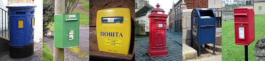
10. It’s time to go about creating our actual bed icon design. There are several factors to consider when designing a symbolic representation of something. Consider reading 10 Mistakes in Icon Design. One example I like is Apple’s mailbox example. Although in the US, we’re used to mailboxes looking like this, around the world, they can actually look quite different around the world, so it is important to consider your potential audience. I started on the bed icon thinking of the lodging signs I see all over the highway. Googling “bed icon” usually gives a pretty good representation of what your bed should look like.
11. Now on to the actual drawing. Select the Rectangle Tool (U). Set the color to white. Start with your basic shapes, and work detail out from there. I started with the mattress. Keep working, switching between the Rectangle Tool, Rounded Rectangle Tool (be sure to keep your radii constant), and the Ellipse Tool. Some helpful keyboard modifiers/tips are:
Holding down Shift while drawing will lock your aspect ratio. If your drawing a rectangle, it will force a square. If your drawing an ellipse, it will force a circle.
Holding down Alt/Option while drawing will let you draw from the center, rather than a corner.
Holding down both Shift + Alt/Option of course does both functionalities at the same time.
In the toolbar for these tools, there are a set of 5 icons to the right of the Radius field. If you select the third one, Subtract from shape area, you can draw new shapes over existing ones that delete the base shape wherever they overlap. This is nice for keeping your shape as a vector, yet being able to access more shapes than just rectangles and ellipses.
12. You should now have your icon looking good. Select all of your new shape layers in the same manner as before and convert them to a smart object. Name this one “bed”.13. It is now time to add the title of the icon, if you wish. You should add a guide to snap to so that all of your icons have their title in identical spots. I set mine horizontally at 125 px.
14. Select the Horizontal Type Tool (T). Pick a readable font, size, white as your color, and type “bedroom”. Click the check box in the toolbar when your finished.
15. Select the Move Tool (V) and make sure guide snapping is on. Drag your text so that it snaps to the guide. Center it up as best you can, and then select the “bed” layer and center this one up as well. If you need to resize anything, worry not. Because we’ve created smart objects, instead of simply merging layers, our vector shapes are preserved, and may be resized indefinitely. To resize a layer, enter Free Transform mode (Ctrl/Cmd + T). Once everything is to your liking, it should look like this:16. You’re done! File -> Save As to save it as a PNG (always use PNG for icons. Use JPG for pictures that don’t have many straight lines).


