Category Archives: Design
An Evaluation of aVoice
aVoice is a Google Voice client for Windows 8. It makes use of some neat interaction paradigms:
- Semantic Zoom
- Swipe to Select (a.k.a Cross-Slide)
The video doesn’t show pinch-to-zoom in, but that’s also possible. In the world of touch, these interaction paradigms are pretty new and they aren’t yet mainstream. I’ll tell you how they’re working for aVoice and some pitfalls to avoid.
Semantic Zoom
I’ve seen two uses for it over several platforms:
- A jump list – Windows Phone’s app list is grouped alphabetically. The semantic zoom gets you to apps that start with Z quickly.
- An information filter – Windows 8’s start screen zooms out to let you see a simpler big picture. Note that this is different from Android’s MIUI ROM launcher, which is simply optical zoom.
aVoice uses the information filter semantic zoom.
A heuristic I think applies heavily to the information filter semantic zoom is recognition rather than recall (#6). The Windows 8 start screen does a great job of letting the user recognize what app they’d like in the zoomed out view by creating the illusion that the user is merely optically zooming out, but being a bit smarter. They disable live tiles and replace them with a small version of the app icon:
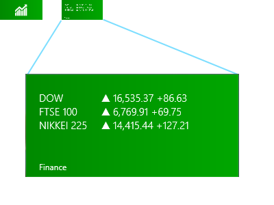
Above, on the upper left is a screenshot of what the Finance app looks like in the zoomed out view (62px x 30px). On the right is what it would look like if the Finance app’s live tile was left on and simply shrunk. Obviously, the left retains meaning while the right does not.
This trick let’s the user recognize where they are spatially and recognize an app by its color and icon.
Unfortunately, aVoice doesn’t work the same way. When zoomed in, messages are in a horizontal stack. When zoomed out, they are in a grid, similar to the start screen. This breaks spatial recognition, and probably explains why I observed friends exclaiming “Wait, where was I?” when using aVoice. In a redesign, I would probably scrap the semantic zoom. It is ill suited for this case. So use caution when considering the information filter style. It could end up being more confusing than helpful.
Swipe to Select
Press-and-hold is the standard selection pattern for iOS (jiggle mode) and Android, but there’s plenty of debate about it.
Swipe to select takes a different approach, allowing users to flick and item down or up to select it. It’s significantly faster than press-and-hold (check out the video here, under Swipe to select, command, and move). However, swipe to select has some issues. Here are a few that I’ve seen with aVoice:
- By virtue of being different, most people attempt to press-and-hold and are confused when it doesn’t work
- Users attempting to quickly pan may accidentally select instead
Press-and-hold results in a hint that you should swipe down, but still doesn’t select the item. This goes against the consistency and standards (#4) of the popular market and ideally aVoice would allow both methods.
Error recovery (#9) is super important to keep a stress-free experience. The accidental selections while panning is worrisome, but fortunately recoverable via the Clear Selection button. If you use swipe to select, be careful about letting it do more than select because the action is frequently unintentional.
The Forgiving User
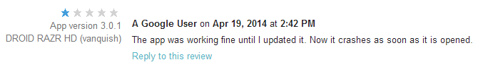
RingPack just underwent a major overhaul. With large amounts of code churn, it starts to become likely that new bugs will be introduced (especially Android’s fragmentation problem). This update was no exception — within 3 hours of pushing a live update, I saw a new crash, a few angry reviews, and one very upset email. Yikes!
There’s a powerful lesson here. Budget time to rapidly respond to user issues on a new release. Luckily, I did. The telemetry data from the Android Developer Dashboard and Google Analytics let me respond within hours.

The surprising thing is how quick users are to forgive once they realize you’re willing to work with them. Even something so impersonal as replying to their review does a lot to diffuse the situation. Of course, your mileage may vary depending on how critical your app is to the user’s life.
Adoption
I was curious how quickly people would upgrade. The answer is — not very quickly.
Roughly 700 users saw the update and gave it a try. Amazingly that’s only about 5% of the user base. I see that as both good and bad. On one hand, lazy updating means more users with a sub-par experience. On the other, it’s nice that only 5% hit the nasty crash in version 8.
In conclusion,
- Budget time to rapidly iterate
- Be responsive and respectful to all users (even the angry ones)
- Love your telemetry
Following these rules can quickly reverse the damage done by a rocky launch.
From Quora: Why perform User Research?
Soliloquy
Design of Information just get’s more interesting! For our 3rd homework, we had to take Shakespeare’s plays (XML-d by Jon Bosak) and display their data in some interesting way. I went with Android as it’s the medium I’m most comfortable with. Soliloquy is the app’s name and it was churned out in about 6 hours (I’m amazed it went that fast).
Soliloquy is an Android application that tries to analyze each one of Shakespeare’s plays for soliloquies. It displays what it finds in a “time line”. The x-axis spans from the first to the last line of the play. The x-axis is colored whenever a soliloquy is detected. This leads to a spatial sense of Shakespeare’s method. The user can observe patterns in soliloquy occurrence and length.
The user may interact with Soliloquy by touching and dragging the handle on the left side of a list element. This will free the element from its position in the list and allow the user to move the element to a new location. This allows the user to group plays by pattern. Shakespeare follows a methodical approach to writing tragedies and comedies. Soliloquy allows the user to detect these and organize them. After organization, a pattern should be visible by comparing the two plays side-by-side.
Clicking on a play will bring up all of the soliloquies for that play, where they may navigate through them by scrolling.

Implementation
The application first performs a setup where it parses each play. This is broken up into multiple threads to allow the user to read the instructions while waiting using Android’s AsycTask. I highly recommend it over normal Java threading.

The parsing is done using Java’s SAX Parser. The title and number of lines are recorded for each play. Soliloquies are detected by watching for <STAGEDIR> elements containing “Exeunt”. I noticed that if a <SPEECH> element appears directly after a <STAGEDIR> containing “Exeunt”, a soliloquy usually follows. Obviously this process is not perfect, but it seems to grab most of the big ones. For example: all of Puck’s soliloquies are detected in A Midsummer Night’s Dream. Each soliloquy goes into a Block data structure. A Play structure holds a list of Blocks.
The resulting plays are then displayed using a custom View that draws rectangles with the same width and spacing as the soliloquies occur in the poem. This TimelineView is part of a custom TouchListView’s items. TouchListView allows the elements to be reordered is courtesy of commonsguy on GitHub.

The code is very simple, with an MVC architecture similar to most other Android applications. SoliloquyActivity.java is the entry point, and ParserHandler.java contains most of the XML parsing code. PlayAdapter.java is the model that the list adheres to.
Overall I think the code is clean. I’ve got it under git and might improve it for fun later :D.