Journal #1: HW1

This is the first post in my blog-based journal for my CS 4364 capstone class at Virginia Tech. It is Design of Information, and we are being asked to write journal entries throughout the class relating to homeworks, projects, and just about anything else worth writing about. I may move it somewhere else later, but this was an easy seat for now.

For our first homework, we were asked to look around us at signs. Prof. Harrison defines signs as intentionally placed pieces of information. Obviously, this is a pretty broad definition that allows for non-traditional sign selections. In this entry, I’m just going to pick a few signs and talk about why I picked them.

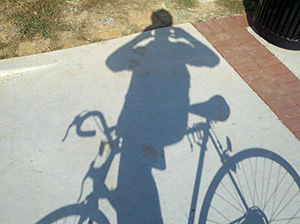
One of the signs we were asked to find was a dynamic display — one that changes what information is displayed as part of its purpose. After thinking of the obvious (plasma TV’s, electronic highway safety signs), I was looking at my shadow as the sun was setting, wondering at how long it was. I’m not sure if it completely qualifies as intentionally placed, but I would suggest that a shadow is a dynamic display. It’s appearance is a constant indicator of the time of day, weather conditions, object shape, and I”m sure many more.

I’ll share some of the other non-dynamic signs I found while riding my bike around DT Blacksburg. We were told that a piece of trash blowing down the street did not count. Again, I’m not sure how much this next example intrudes on that, but I thought it was a very interesting sign.

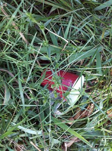
A red solo cup rudely thrown in the grass on the side of the road. I’m assuming that it still rests where it was thrown, which is why I consider this information useful. I took several other pictures of Coors, Red Bull, Natty, and Yuengling (classy) cans along the same stretch. The point: I think this cup, along with the other trash, is a solid sign that drunk kids walk the stretch of road in front of the Sig-Ep house on Clay St. frequently. Intentional? Ehhh — maybe. We’ll see what Harrison thinks.

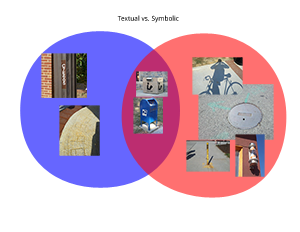
Anyway, I ended up with 16 photos from places around downtown and called it a day. The next step was to organize this information in 3 creative ways (Design of Information is big on information organization). My first thought was to break the signs into two categories: text-based and sign-based. Then I realized that some signs (such as a post box) had both. What do you do when you have 2 distinct categories with some that overlap? Venn diagram!

Simple. OK, what’s next? I was stumped for any creative ideas for a little while, focusing too much on the content of the pictures. The last 2 ideas came at once.

  1. Somebody might care where these photos are. I remember where I took each one as I biked. Why not map them by location so that somebody could retrace my steps and guess at my path?
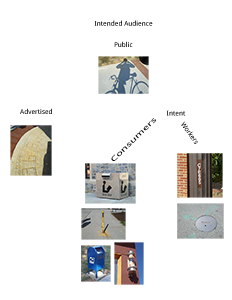
  2. How about who each sign targets as its audience? Certain signs are meant for a very specific audience.
I realized that the 2nd option actually left a lot of room to include a small hierarchical organization, so I decided to give it a shot.
Totally unsure how how useful this one is, and it’s the organization I’m least proud of. But oh well, that’s all for now. I’ll include some thoughts on Design Observer in the next post.

OneSeven: How to get the time zone

click to enlarge

Over the weekend I got bored with my homescreen. I tried several widgets like BattStatt, Tajm, dClock, and TypoClock, but they all took up at least 2 rows of my homescreen, or I didn’t need the information. I loved dClock’s week display since the actual day isn’t obviously visible on Android anywhere but the lock screen. So I went ahead and made my own simple week widget over the weekend.

Obviously, the week widget needs to display the correct day to the user, which can vary depending on time zone. It should also know when midnight/the start of the new day is, so that it may change. I’ll share with you how to get the current time relevant to the user.

/**
 * The private getDay method gets the current time zone and then returns
 * the integer day of the week for this time zone.
 *
 * @return		The day of the week (see Calendar.SUNDAY)
 */
private int getDay() {
	 TimeZone t = TimeZone.getDefault(); //gets the phone's curr timezone
 
	 // create a our current time zone
	 SimpleTimeZone pdt = new SimpleTimeZone(t.getRawOffset(), t.getID());
 
	 // set up rules for daylight savings time for 2010, US
	 pdt.setStartRule(Calendar.MARCH, 14, 2 * 60 * 60 * 1000);
	 pdt.setEndRule(Calendar.NOVEMBER, 7, 2 * 60 * 60 * 1000);
 
	 // create a GregorianCalendar with the Pacific Daylight time zone
	 // and the current date and time
	 calendar = new GregorianCalendar(pdt);
	 Date trialTime = new Date();
	 calendar.setTime(trialTime);
 
	return calendar.get(Calendar.DAY_OF_WEEK);
}

This method returns the current day of the week depending on the user’s timezone. The Daylight Savings is adjusted to this year’s US date’s, but you could easily add clauses to change it for other countries.

Now that you have the day, you can easily calculate where midnight will be (either by raw calculation or just create a new calendar and bump it forward to the desired date/time). I used AlarmManager to set a repeating alarm every day.

OneSeven is available in free and pro versions. Please click here to view the features of each.

RingPack Beta Launch

click to enlarge

Today, I’m launching my very first app under the Cryclops name. It’s called RingPack, and is currently available on the Android market in beta testing.

The idea started with a very simple desire. I get a lot of texts/notifications, and usually whatever ringtone I choose for my text ringtone (the Default Notification Ringtone in Android), I grow to hate after a while. It starts with loving the new tone, and being impressed with it for a few weeks, but then — just like a hit song on the radio — the repetition finally gets to me and I can’t stand it anymore.

RingPack started as a solution to this annoyance. I thought it would be kind of fun to not know what sound your phone was going to make next. Obviously, I want my actual ringtone (the one people get when they call me), to remain the same, otherwise I wouldn’t know what was ringing. But the text notification had some room to wiggle. So I came up with 3 main ideas I wanted to accomplish:

  • The first idea was to have the app shuffle around different, yet similar sounds. For instance, it would shuffle your tone between all known guitar chords in the key G. This way, you’d still be expecting the correct pitch, but you wouldn’t know the exact mood of whatever chord was coming.
  • Then I thought about theming. I loved Ocarina of Time as a kid, and wouldn’t it be cool to have a themed set of notification tones, all from the same game. That way, instead of just recognizing it by key, I would recognize it by association.
  • Lastly, I remembered my girlfriend, who always has the same exact song snippet as her text tone. “Still D.R.E.” That gets stuck in your head all day. Wouldn’t it be cool if your phone could progress through the song as you get texts?

So I thought I’d pack together ringtones in “packs” and make an app to manage them.

Long story short, after a month of development I’m proud to release the beta version of RingPack. I think you’ll like the UI, especially the implementation of custom QuickActions based on this tutorial. The app is based around a Service, to swap out tones in the background, and BroadcastReceivers, to tell the Service when it needs to make a change.

I ran into some limitations on my “perfect” idea of an implementation simply due to constraints in the Android framework. For instance, the only notification I can listen for is incoming SMS’s. Things like incoming Google Talk and Voice messages simply don’t seem to be a thing that I can detect. To compensate for this, I’ve given the user the option of listening for time ticks instead. You can have your tone rotate on either 1 minute or 5 minute intervals. In the future, I’ll probably give the user more options (perhaps once daily, weekly, after every phone call).

Features include:

  • Intuitive UI
  • (2×1) Widget
  • Shuffle, Lock, and Rotation preferences
  • Easy on the battery background service
  • Extend-able packs! (I’ll post more on how you can make your own packs soon)

I’m allowing Android 1.6 and up to install it, although users who are below Android 2.0 might experience some issues with the background service. Android 1.6 has some issues with restarting the service. I’ve done my best to try to fix those issues for now, but as I’m testing on 2.2, I can’t confirm for sure.

Known bugs:

  • The 1.6 thing
  • Playing mp3 ringtones very quickly (using the widget) will result in the mp3 decoder becoming overloaded and Android will panic and reset the Default Notification Ringtone to it’s most basic one. If this happens to you, simply open RingPack, select the “None” pack, then your desired pack and it will return to normal. I’m working on this. It seems ogg files may be a better choice.
  • After a restart, RingPack can take up to 1 minute to restate itself.
  • Sometime the interface is slow to respond. I’ve not been so good about breaking into Threads. This is my first priority to fix.

If the app Force Closes on you (which I’ve done my best to stop. In fact in the last week of testing, I haven’t hit any), it has the potential to leave a orphan entry in your MediaStore library. It’s not harmful, but if you’d like to clean it up, I recommended using the ever popular ringdroid. Just open it, click Menu>Show All Audio>Search for “ringpack”. If there’s an entry there, longpress it to delete it and you’re all cleaned up. There is a special case where the Service manages to delete the file, but misses the MediaStore library entry. Ringdroid will tell you that it couldn’t delete the file in this case, but it lies. The entry will have been removed from your library. I’ll definitely be implementing my own fix for this type of thing soon, but for now this works.

Lastly, screenshots can be found on the official RingPack page. Look there in the future for more goodies.

Market Link

greenHome (How to share MotionEvents)

click to enlarge

This semester at Virginia Tech, a friend and I lucked out with the opportunity to join up with a professor doing research in how to use smartphone features to save energy. We’re using things like the light sensor, the accelerometer, and the GPS to save energy in neat ways. However, the first app to come out uses none of these. Think of it as an advanced Hello World.

The idea behind greenHome is to give the user energy saving tips depending on their location in the house. It starts with a homescreen that lets the user pick what room they’d like tips about, then brings up a list of tips. We let the user navigate through these in some cool ways.

click to enlarge

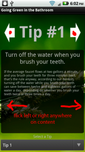
The user can navigate through tips in this activity by either touching the left and right arrows at the top, or flicking left or right, as long as the flick is in the content. We used a custom ScrollView nested inside of a custom ViewFlipper to accomplish this with nice animations. I’ll post a tutorial on how to use a ViewFlipper soon.

What’s cool is that we share touch events between the ViewFlipper and the Scrollview, which is a bit tricker than you’d think.

//flipper is my custom ViewFlipper
flipper.setOnTouchListener(new MyOnTouchListener());
 
public class MyOnTouchListener implements OnTouchListener {
 
    @Override
    public boolean onTouch(View view, MotionEvent e) {
        //give the scroller it's data
        //sc1 is the first child view of flipper
        if (flipper.getCurrentView().getId() == R.id.sc1)
            scr1.onTouchEvent(e);
        //sc2 is the second child view
        else if (flipper.getCurrentView().getId() == R.id.sc2)
            scr2.onTouchEvent(e);
 
        //reset on release
        if (e.getAction() == MotionEvent.ACTION_UP)
            firstTouch = true;
 
        //check for a flick...
 
        return true;
    }
}

The above code has some weird aspects. Stepping through it, we

  • Set the ViewFlipper’s OnTouchListener to MyOnTouchListener.
  • In the onTouch() method, we begin by handing down the touch data given to us (since we’re the parent in the layout) to one of our visible children (sc1 or sc2) by calling the child’s onTouchEvent.
  • Take care of flipping (I’ve taken that specific code out for simplicity).
  • Return true.

The un-important looking return true is actually very important. It turns out that if a view’s onTouch() method returns true, that means that this event has found it’s home, and it does not need to continue to other view’s. Logically, I would think that I’d want to return false here, since I’d love not to have to give out the event to my children myself, it would seem that Android would do that for me. However, I tried that and it didn’t work. Perhaps the event didn’t get handed to my ViewFlipper before it’s children.

For mine to work correctly, my ViewFlipper’s onTouch() had to give the event to a child, then return true. Also, my children’s onTouch() had to return false.

How I Designed the Cryclops Logo

click to enlarge

I’m a CS student. I’ve taken no classes in graphic design and up until a few weeks ago, I didn’t even know my way around Photoshop. Here I’m going to attempt to offer a few tips to those who are like me. People like developers who need custom icons for their apps, web devs who would like to add some original work, or just anybody who’s interested in how I learned.

First off, as you know, I design for Android. We’re going to have to back up a bit to talk about how I started learning icon design. When we were finishing up the first version of our greenHome app, I was left with the actual visual design left. Since the app has such a simple purpose (merely an organized selection of tips), we wanted to make the interface stand out. Programmatically, we added things like intuitive flick and swipe gestures, rather than just your standard buttons. Visually, we settled on a nice background, and a transparent glass-like theme.

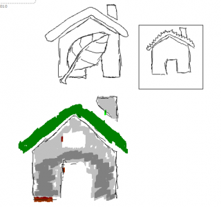
My first attempt at designing the launcher icon was pretty dismal. I took the first few steps correctly, beginning by sketching out some ideas.

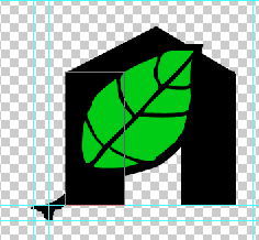
Since greenHome focused on tips for being greener at home, it was natural to try to use some symbolism between the two. Not so bad. Now here’s the first attempt in Photoshop:Not exactly pretty. More like terrible. I realized I didn’t know my way around Photoshop in the least. Maybe some tutorials would be a good idea. I headed over to this Illustrator tutorial on how to make leaves. That was helpful, and I was able to make a nice leaf. Unfortunately, when I brought it into Photoshop and scaled it down to the appropriate sizes, it looked like hell. Jaggy lines, anti-aliasing errors left and right, and overall just very ugly. I didn’t know what was going on. Time for more reading. The Android 2.0 Icon Design specs (see the links to the right) helped out a lot with what I was missing. Their main points:

  • Design your launcher icon in the mdpi resolution first, then scale up 150% for hdpi and down 75% for ldpi, touching up any issues in each version.
  • Conform to the other icon’s design scheme, as far as colors, drop shadow, glow, and variety go. They even provide a very helpful list of colors.
  • Keep it simple, but realistic.

The next try was a lot better, and what I ended up going with. Just following their recommendations for color, drop shadow, glow, and bezel helped a ton. The only thing I did a bit differently was not working at the mdpi resolution. I wanted a big version, so I started at 480 x 480 px and scaled down for each resolution. Be sure to mess with the image reduction algorithm in the Image Size dialog box for the best results. The downside to this is that the 36 x 36 icon may not look as crisp without touch-ups.

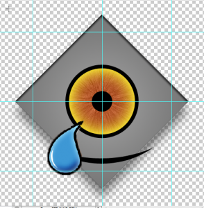
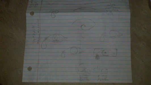
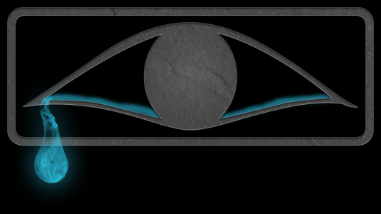
So onto the Cryclops logo. The name yields itself to an easy symbol, a crying cyclops. I started out Googling what common images of cyclopes looked like and went from there. The first result wasn’t bad at all.I kept touching it up until I got the above result. I stuck with this logo idea until I actually started thinking about what I wanted my site to look like. I was going for a more professional, crisp vibe. Time for a redesign! This time I didn’t stray too far from the same ideas, just tried to make it less cartoon-y.I didn’t take this one too far. For some reason this reminded me of Clippy (oh hell no). A few days went past before I had any other ideas. One day after class, the idea struck me that I should try to make it look old (after all, cyclopes are mythical and stuff). Instead of thinking Greek, I thought Egyptian Hieroglyphics first. Did some more Googling for a Hieroglyphic eye and came upon this Wikipedia page. The idea of a stone eye mixed with realistic water welling up in it struck me as a cool idea, so I started sketching what I saw there and on the image results.I went with the boxed eye idea, copying this hieroglyph pretty closely. Remembering the Android 2.0 spec’s recommendation that I try to keep things realistic with textures, this design popped out:It consists of vector art, a slate texture set to overlay, and a cool Photoshop brush made by this cool dude. I thought it was pretty banging on black, but after letting one of my friends give his opinion, I decided to tweak it a bit. I decided that although the slate texture was cool, it probably would be hard to fit the rest of the site design around that much texture. Next, I decided that without the slate, the realistic water droplet didn’t fit either. I needed a cleaner water design. So I drew in some vector water.

That’s the final result. Four design revisions and around 20 hours of work. Damn this stuff ain’t easy, but I’m happy with the result.