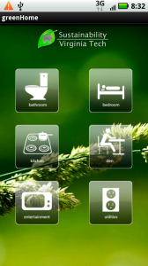
For my group’s greenHome application, we designed a main screen that takes the user to one of 6 rooms in the house. The app features a very clean interface that separates it from the majority of Android apps, and we wanted to keep it that way. I was tasked with designing an icon for each of the rooms to put into a GridView. Some of the choices I had to face were:
- How detailed should the icon be to be effective on all screen densities (hdpi, mdpi being the target audience)?
- For example, an icon that has high detail at 150 x 150, will look absolutely terrible at 48 x 48, since there is no way for the details to be “crunched” into less pixels and look good.
- On that note, should I create multiple versions of the icon with different detail levels?
- How should the design distinguish itself from Android in general, yet fit with the app’s UI?
- Transparent or opaque?
- Colors.
The first thing I went about doing was deciding that it would be nice to offer semi-transparency, since we had a nice background, and I was planning on transparencies being common throughout the app. I searched Google for “android glass icon” and got this, which shows a Vista/Aero-ish effect. To get that top shine effect, I remembered a cool tutorial I’d seen called Design The iTunes Icon For The iPhone And iPod Touch.
For colors, I went with the Android color recommendations in the Icon Design Guidelines, Android 2.0 spec, selecting their grey tones.
Here’s how you can make a bedroom icon that looks like this: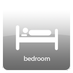
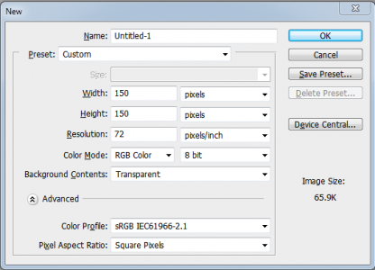
1. Open Photoshop, go to File -> New… and create a new image with your preferred dimensions (150 x 150). Select RGB color, 72 pixels/inch, and a transparent background. Click OK.
2. Next, go about setting your guides, to ensure that you have a symmetrical icon. Give yourself 5px of padding on all sides. This will allow glow/drop-shadow effects to not be cut off. Go to View -> New Guide… -> [vertical, 5 px] OK. Then put another vertical on at 145 px (150 – 5). Do the same, only with the horizontal option selected. Turn on Snap by View -> Snap To -> Guides. It should now look something like this.
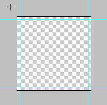 3. Now it’s time to draw the background. Name the base layer Photoshop created “background”. Choose the Rounded Rectangle Tool (U). Set the radius to 8 px. Choose black for the color. Start at the where the guides intersect at the top left corner and drag to the bottom right. Let the shape snap to the guides and release.
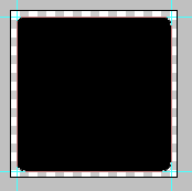 4. Now right click “background” in the layers pane and select Rasterize Layer. This will convert the vector shape to bitmap. Duplicate “background” by selecting Layer -> Duplicate Layer. Name the duplicate “accent” and put it above “background”. Turn off its visibility and reselect “background”, we’ll come back to the “accent” later. Now, hold down Ctrl or Cmd and click the layer thumbnail for “background” to select it. You should now see a dotted line around the border of your shape. Select the Gradient Tool (G). Set its options to Linear Gradient, then click to edit the gradient. Select the first preset, Foreground to Background, and set the first color to black and the second to white. Click OK. Now draw the gradient over your shape vertically (make sure the shape is still selected) by holding down Shift to keep it at 90 degrees. Drag from the bottom to the top. Now turn the layer transparency down to 55%. Try to get it to look like this:
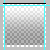 5. Remember that layer we named “accent”? Select it and make it visible again. It should now obscure the semi-transparent layer completely. The idea now is to create the curve that will make this button appear 3D, or make it “pop”. Select the Elliptical Marquee Tool (M). Click and drag it so that there is a light arch cutting the square in half horizontally. When you like the shape that you see, invert your selection by Select -> Inverse (Ctrl + Shift + I). Make sure the “accent” layer is selected and press Delete. Then de-select by hitting (Ctrl/Cmd + D). It should now look like this:
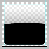 6. Drop the opacity on the “accent” layer a great deal. I dropped it all the way to 9%. Your basic button is now done. However, it would be nice to add a 1 px opaque border to the icon to distinguish its edges (since it is semi-transparent). To do this, create a new layer above everything. Name it “edge”. Select the Rounded Rectangle Tool (U) again with the same settings (8 px radius), only this time make it white. Drag it out again, from the top left corner to the bottom right and let it snap to the guides. It should now cover everything perfectly.
7. Once again, rasterize the “edge” layer and select it by holding down Ctrl or Cmd like in step 4. Now go to Select -> Modify -> Contract. Contract by 1 px and press Delete. You should now be left with a white, 1 px wide border around your button. Your layer layup should be “edge” at the top, followed by “accent”, with “background” at the very bottom. Turn off the guides by View -> Show -> Guides (Ctrl/Cmd + ; ). Zoom in and in inspect your work. The border should look like this now: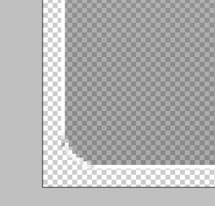
8. Our basic button is done now. A wise idea would be to save this file as a template for future buttons. File -> Save (Ctrl/Cmd + S) and name it “glassButtonTemplate.psd” or something. Then we’ll start our bedroom icon by File -> Save As (Ctrl/Cmd + Shift + S) and name it “bedroomGlassIcon.psd”.
9. Highlight the “background layer by clicking on it, then hold down Shift and click the “edge” layer. All 3 layers should now be selected. Right-click on any one of them and select Convert to Smart Object. Name the new layer “buttonBackground”.
10. It’s time to go about creating our actual bed icon design. There are several factors to consider when designing a symbolic representation of something. Consider reading 10 Mistakes in Icon Design. One example I like is Apple’s mailbox example. Although in the US, we’re used to mailboxes looking like this, around the world, they can actually look quite different around the world, so it is important to consider your potential audience. I started on the bed icon thinking of the lodging signs I see all over the highway. Googling “bed icon” usually gives a pretty good representation of what your bed should look like.
11. Now on to the actual drawing. Select the Rectangle Tool (U). Set the color to white. Start with your basic shapes, and work detail out from there. I started with the mattress. Keep working, switching between the Rectangle Tool, Rounded Rectangle Tool (be sure to keep your radii constant), and the Ellipse Tool. Some helpful keyboard modifiers/tips are:
- Holding down Shift while drawing will lock your aspect ratio. If your drawing a rectangle, it will force a square. If your drawing an ellipse, it will force a circle.
- Holding down Alt/Option while drawing will let you draw from the center, rather than a corner.
- Holding down both Shift + Alt/Option of course does both functionalities at the same time.
- In the toolbar for these tools, there are a set of 5 icons to the right of the Radius field. If you select the third one, Subtract from shape area, you can draw new shapes over existing ones that delete the base shape wherever they overlap. This is nice for keeping your shape as a vector, yet being able to access more shapes than just rectangles and ellipses.
12. You should now have your icon looking good. Select all of your new shape layers in the same manner as before and convert them to a smart object. Name this one “bed”.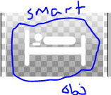 13. It is now time to add the title of the icon, if you wish. You should add a guide to snap to so that all of your icons have their title in identical spots. I set mine horizontally at 125 px.
14. Select the Horizontal Type Tool (T). Pick a readable font, size, white as your color, and type “bedroom”. Click the check box in the toolbar when your finished.
15. Select the Move Tool (V) and make sure guide snapping is on. Drag your text so that it snaps to the guide. Center it up as best you can, and then select the “bed” layer and center this one up as well. If you need to resize anything, worry not. Because we’ve created smart objects, instead of simply merging layers, our vector shapes are preserved, and may be resized indefinitely. To resize a layer, enter Free Transform mode (Ctrl/Cmd + T). Once everything is to your liking, it should look like this: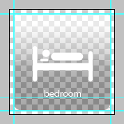 16. You’re done! File -> Save As to save it as a PNG (always use PNG for icons. Use JPG for pictures that don’t have many straight lines).
Here’s how mine look in the app:
